

4.27.2011

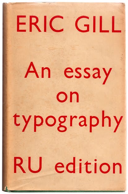
In this volume, famed typographer Eric Gill deals with both general typography questions and the interface between 20th century industrialism and age old craftsmanship. I found the somewhat baroque perspective to be refreshing and enjoyed both parts of the book. Gill is quite skilled at his craft and has a lot to contribute to the field of typography. Some of his ideas are fairly unconventional; take, for example, his priority on even word spacing over line length, which results in a ragged right margin compared to the more common justified version in modern books. This was also the first book I’ve read that consistently used the pilcrow as a paragraph marker.
Even the more technical sections contain a healthy scattering of little philosophical asides, often from the context of typography and design generally. Gill divides the societal landscape into two intrinsically competitive groups, the industrialists and the craftsmen. Although he makes it clear which side he prefers, he does not decry or condemn those involved in machine printing and other mechanical endeavors. Instead he points out the unique attributes of the personal, handmade tradition where men take ownership of their work and which mechanization destroys through homogenization.
A short book, I recommend it to anyone vaguely interested in design or typography.